RAHEJA CARE

One of the leading real estate developers in Mumbai, India, Raheja Universal came to Flying Pencil to launch a separate segment - Raheja Care. The core objective of this new segment was to take Raheja’s offerings a notch higher by providing their existing residents with apartment maintenance and management services at exclusive rates along with a host of other benefits.
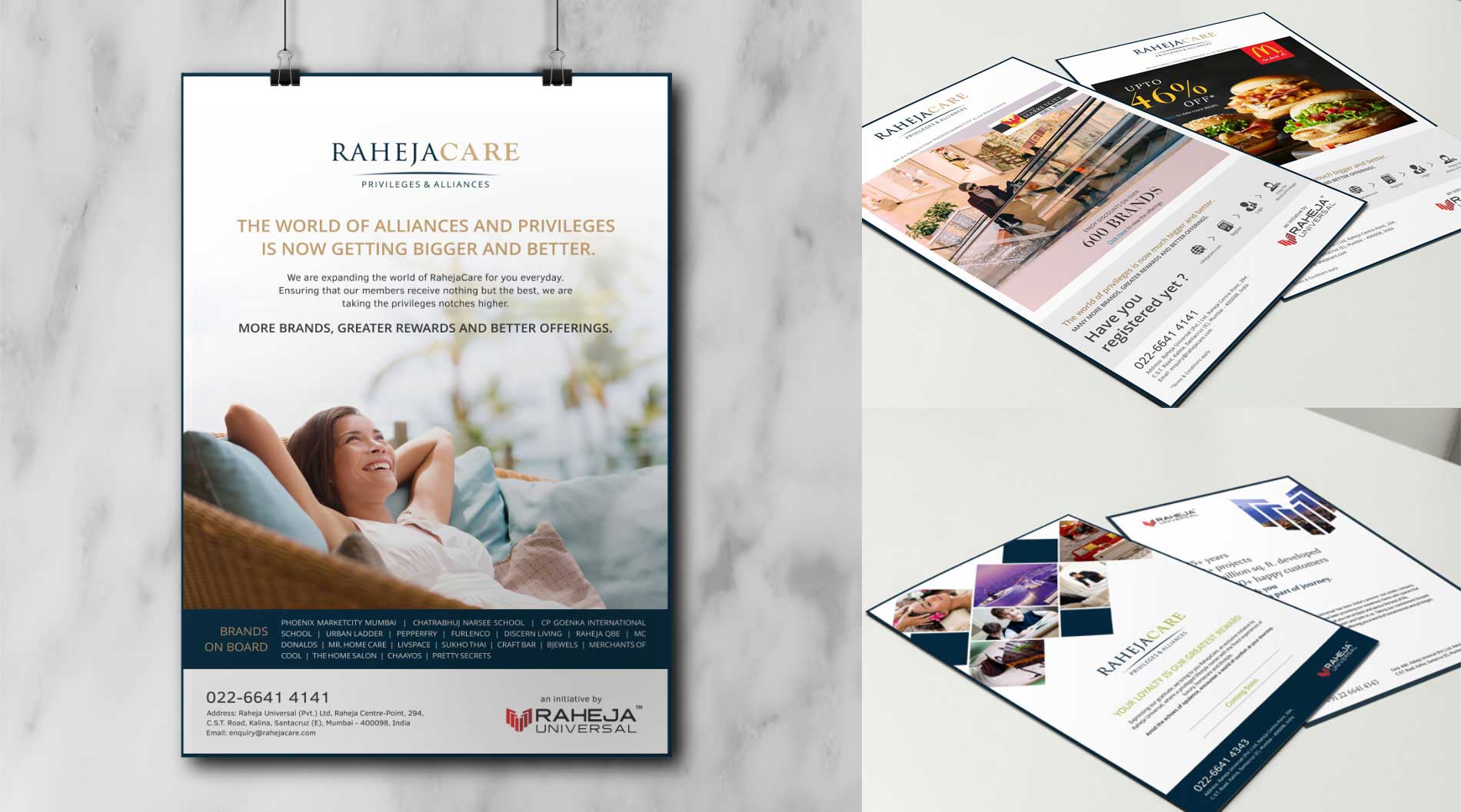
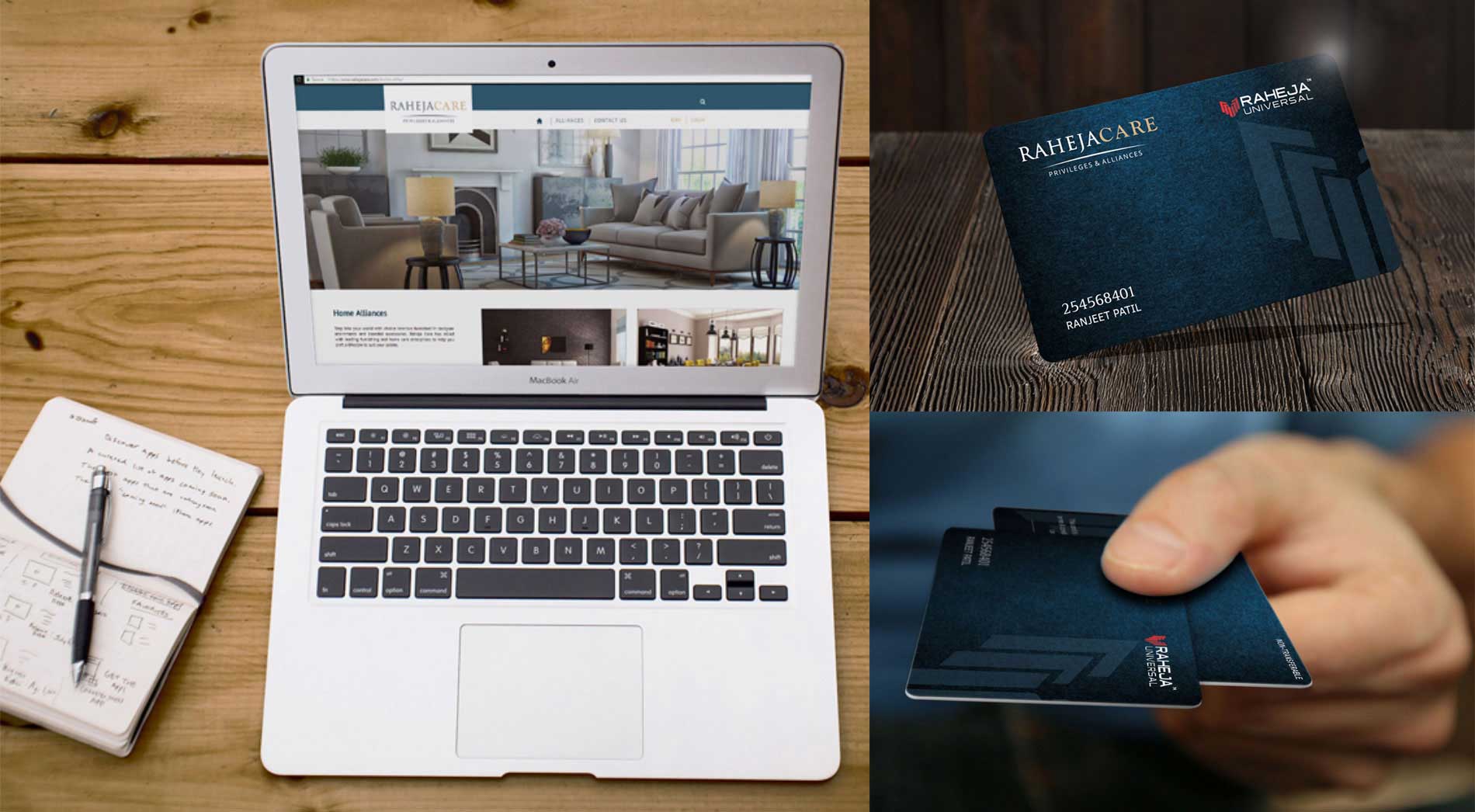
Apart from setting the brand foundation through a brand story, the brand alliance initiative needed to find an accredited foothold in the market with appropriate branding, website, interactive content development and print.

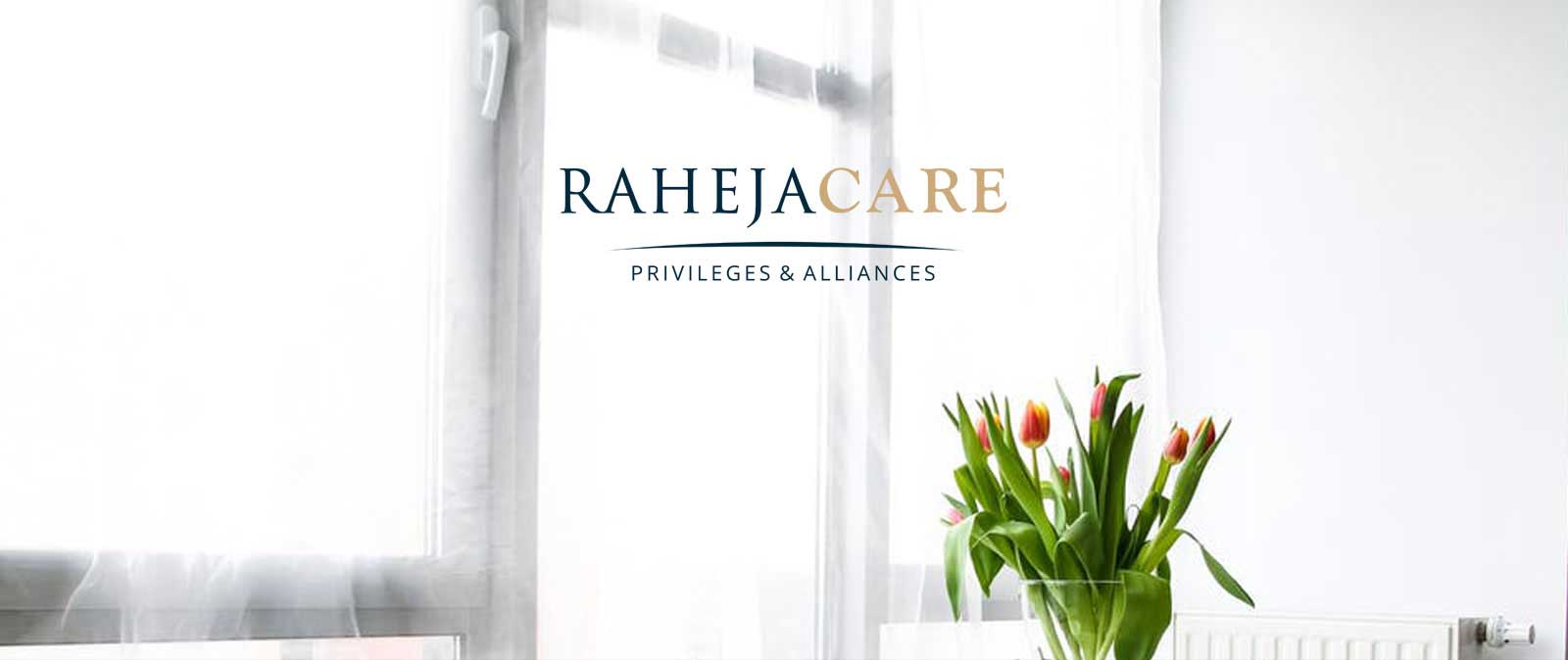
The logo
Positioning the brand in the luxury sector, we decided to keep the logo minimal. The simple lettering with the bold underline defined the name, while the dark blue paired with gold exuded the refined taste.
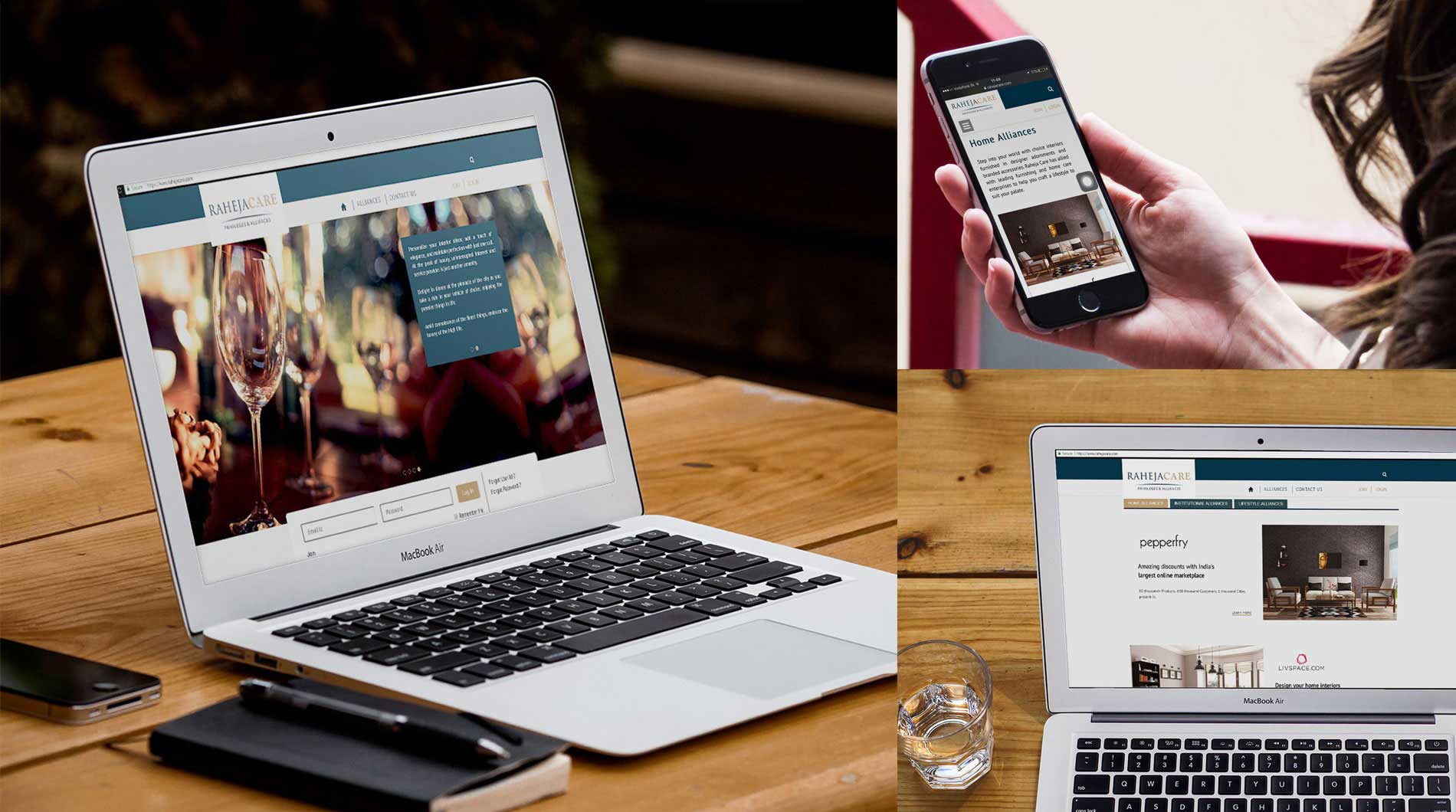
Inspired by the easy and elegant life of the social elite, RahejaCare was placed to reflect the higher echelons of society with a refined palate as mirrored through sumptuous interiors and gold accents. Images that reflected the good life were at the core of its branding identity.
Placing RahejaCare as a separate segment, the brand identity was established through a dark blue and white colour scheme to emphasize elegance, while the gold accented finishing completes each page for an air of eminence. To launch the segment as well as drive the message on relevant platforms, we conceptualized a multi-media full website, an email marketing campaign, a 3-piece direct mail campaign, and a lot of other internal communication initiatives.